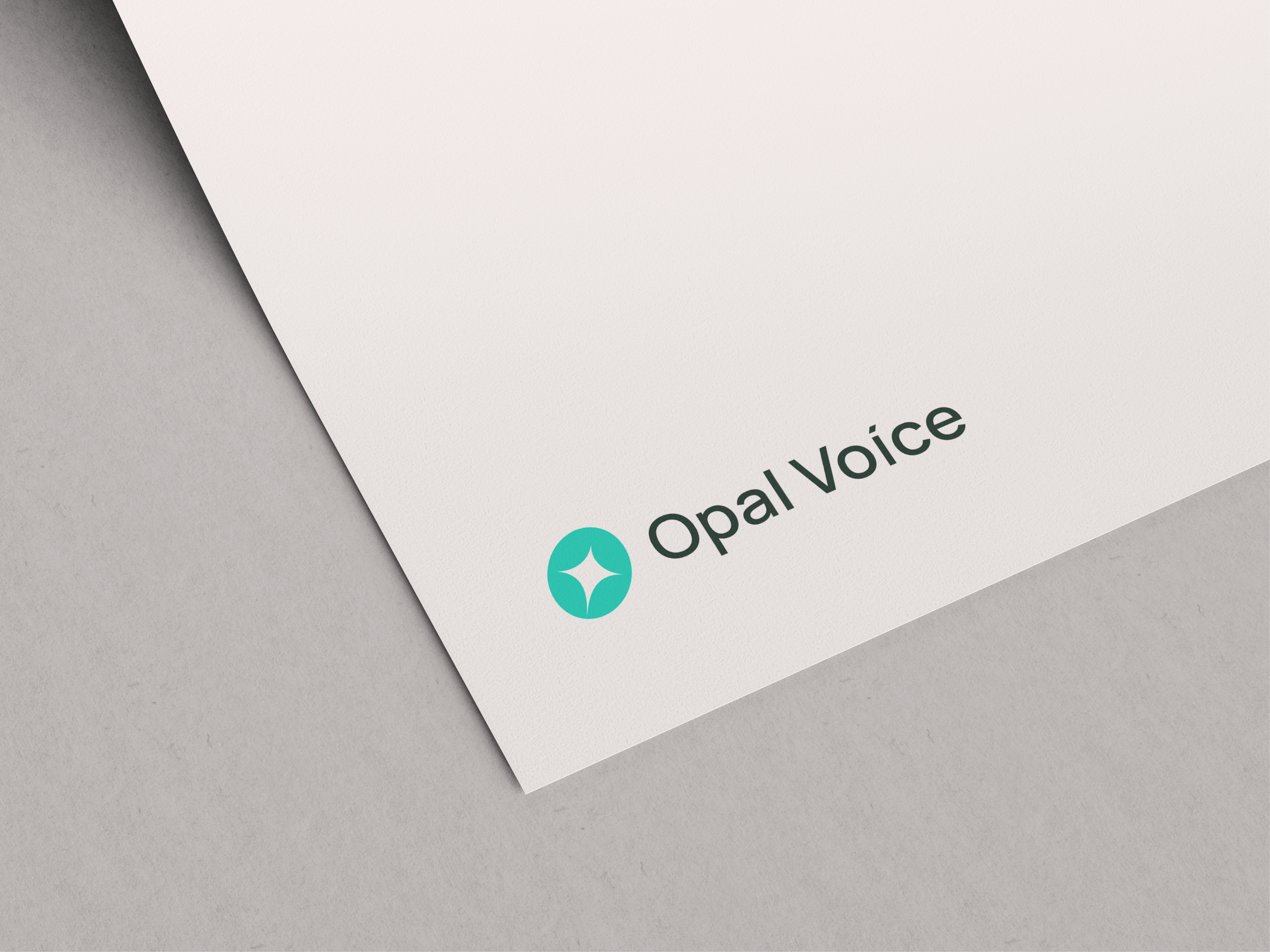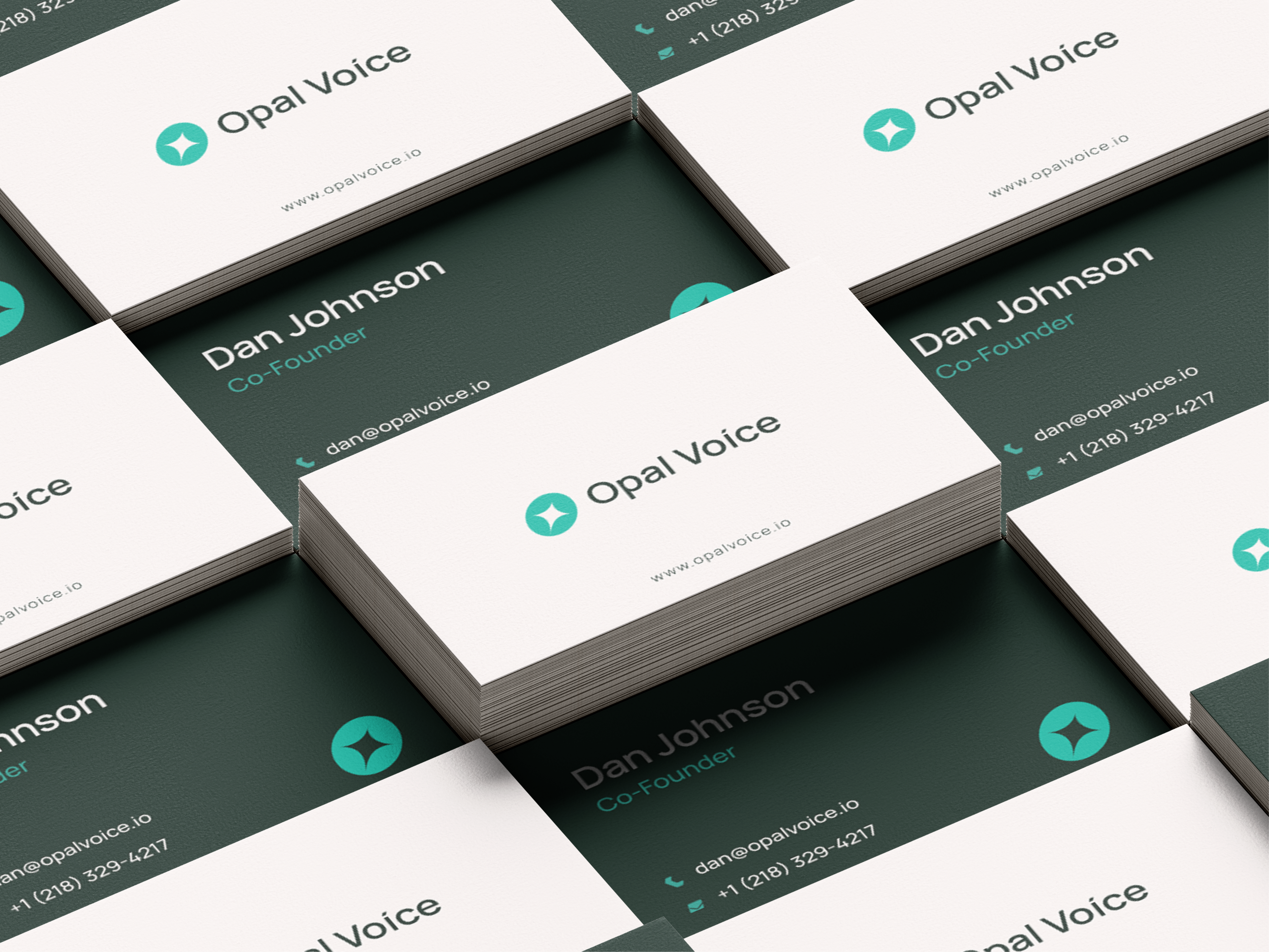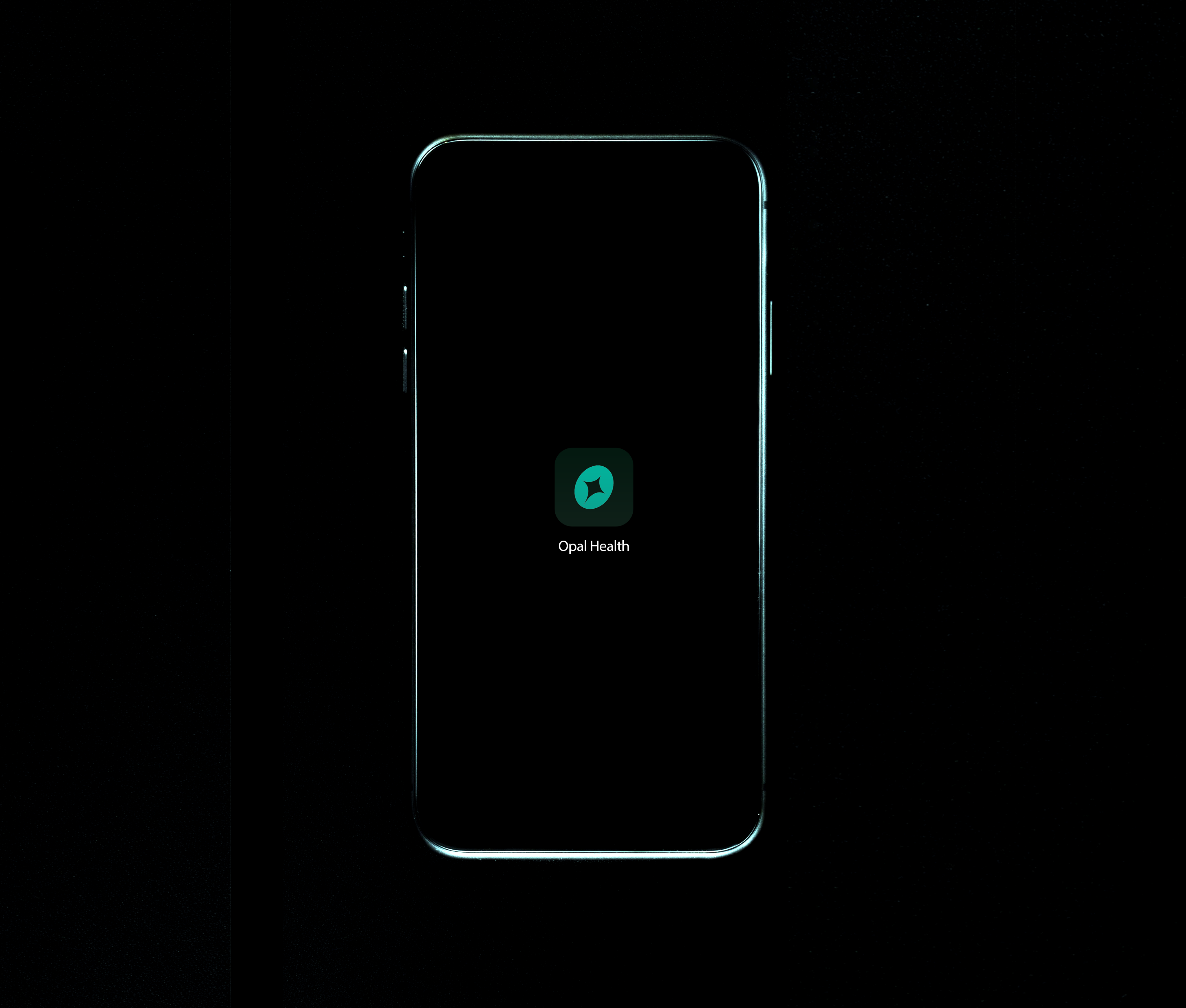
A mark shaped by light, movement, and possibility, designed to feel alive, curious, and forward-looking.
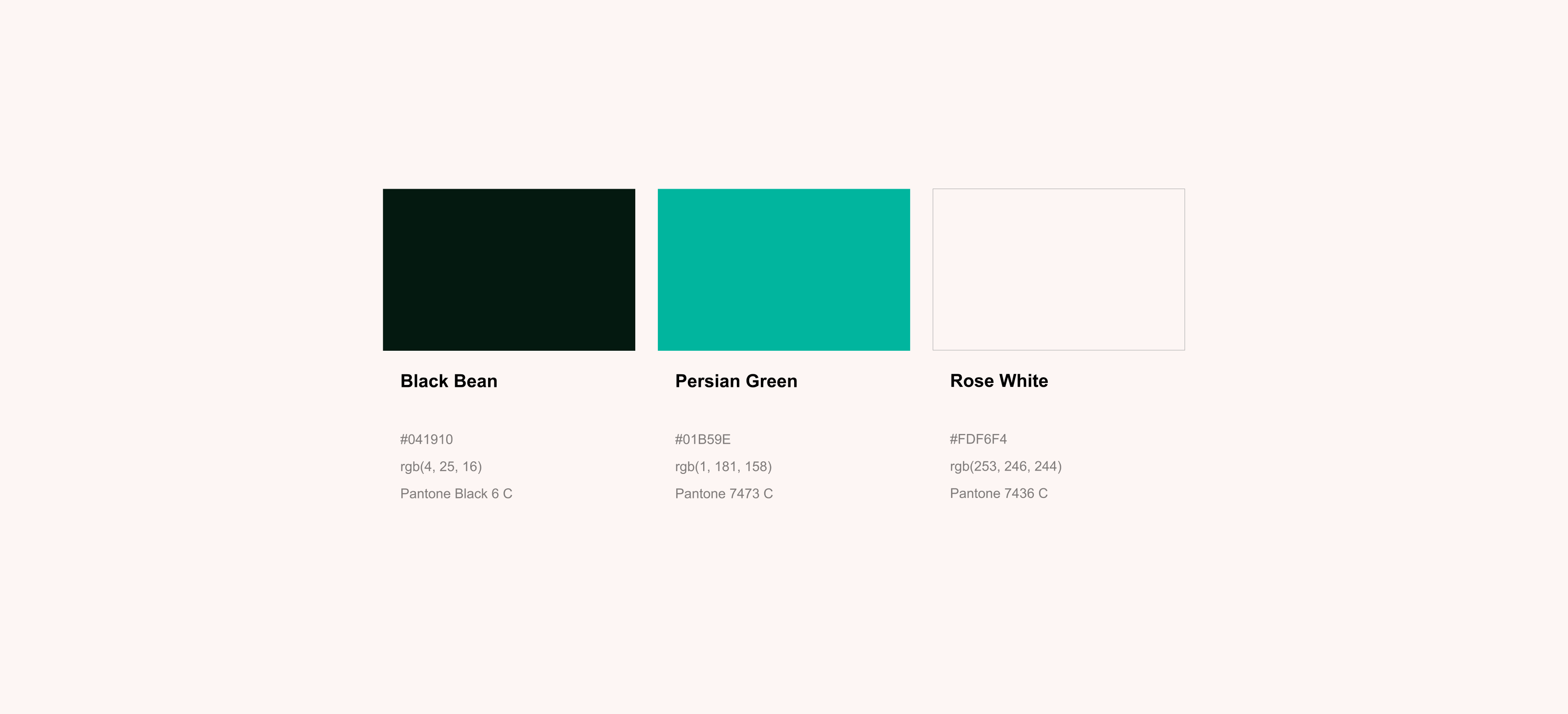
The logo draws its inspiration from opal, bright, fluid, and ever-changing. Like opal, it reflects possibility rather than certainty, capturing a sense of openness, adaptability, and quiet optimism. The form is intentionally soft yet luminous, allowing the identity to feel approachable while holding depth.
At the heart of the mark sits a small star, representing AI. Not as something overpowering, but as a gentle spark: a guide that supports, enhances, and illuminates. It signifies intelligence that works alongside people, helping them navigate complexity with clarity and confidence.
The subtle forward tilt of the logo introduces a sense of motion, as if the mark itself is leaning into what’s next. This shift symbolizes progress, continuous learning, and growth, an identity that isn’t static, but evolving. Together, these elements come together to express a brand that is future-ready, intuitive, and driven by possibility rather than speed.