Branding Brilliance in Politics
Devika Gopinathan
Campaigns are basically branding. And in branding, design often does the heavy lifting. Colours, typography, posters, even murals aren’t just aesthetics. They’re signals of identity, power, and belonging. Let’s dive into some of the most fascinating intersections of politics and design.
Branding New York’s Working Class!
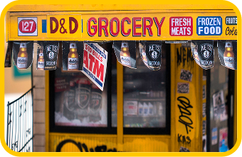
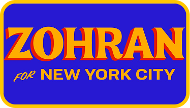
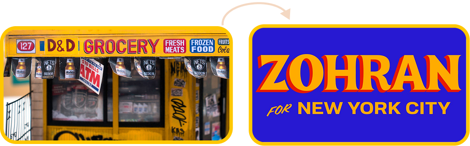
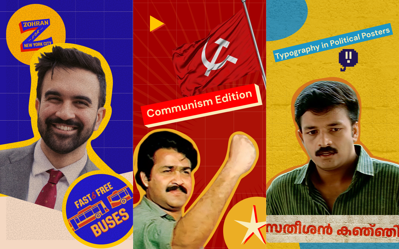
When Tyler Evans and Aneesh Bhoopathy worked on Zohran Mamdani’s campaign, they didn’t just create election posters, they built a living, breathing narrative that screamed New York and the struggles of its working-class.
The hand-drawn wordmark nods to the classic hand-painted signs you’d spot outside New York bodegas. They’ve always been a lifeline for working-class communities, stocking affordable food and daily essentials. By pulling from that visual language, the campaign instantly felt grounded and real.
The color palette tapped into New York’s street vibe - gritty, vibrant, and unapologetically alive, carrying that energy into posters and digital assets.
Mamdani’s team also created content for TikTok and other social platforms, mixing English, Bangla, Spanish, and more, which is what New York is all about! Mix of cultures and people from all around the world.
For immigrant and South Asian communities, design borrowed from the bold theatricality of Bollywood posters. Exaggerated drop shadows and dramatic compositions created a familiar sense of belonging while embracing cultural plurality.
“The hand-drawn wordmark nods to the classic hand-painted signs you’d spot outside New York bodegas”
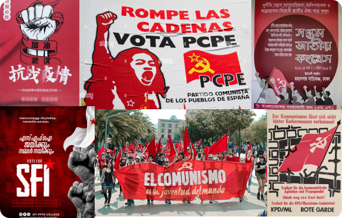
A Brand That Grew Organically
Unlike the meticulously strategized branding of modern campaigns, communism as a political identity grew naturally from the ground up. It wasn’t polished in boardrooms, it spread through the hands of people, through murals, flags, and songs.
Communist branding didn’t begin as design. Instead, it began as movements. Hand-painted walls, red banners across towns, and flag processions became the visual DNA of the ideology. Red in communism is not decorative, it represents blood turned into sweat, sacrifice, solidarity, and resistance. It is a reminder of struggle, uniting people across borders and generations.
In Kerala, the streets themselves become living canvases of memories from the revolutions, during the campaigns. Walls, flags, and murals tell the story of collective struggle. Beyond branding, this is a lived experience. The same spirit that paints walls red is the one that mobilizes communities during crises, making Kerala a global sensation for resilience.