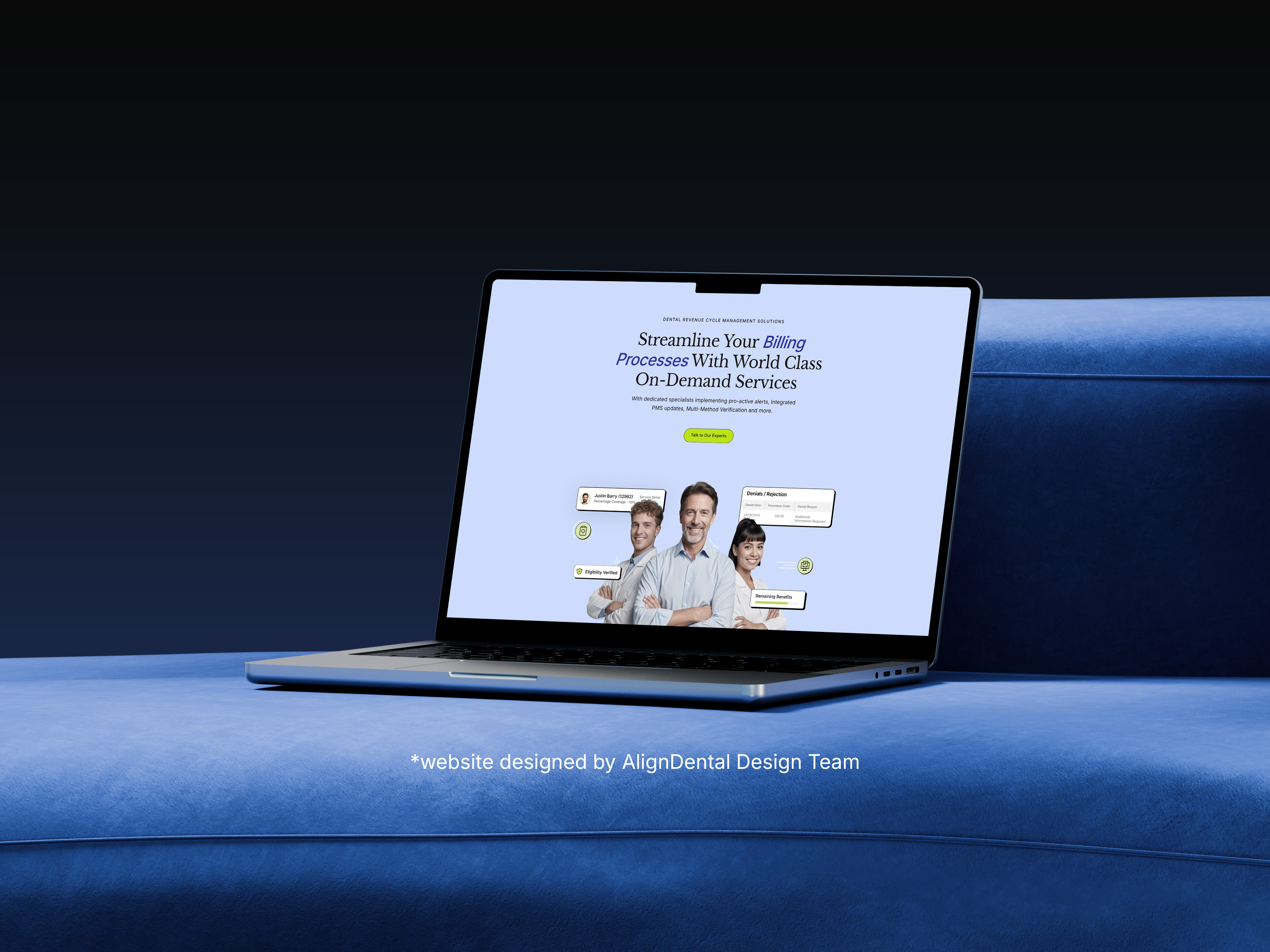
Brand identity design
The Align Dental logo is derived from the letter “A” in the word “Align”, broken into three forms that represent the continuous cycle of revenue. The color palette bursts with vibrant hues, inspired by the spirit of local neighborhoods, warm, lively, and full of character. These rich tones reflect the diversity and energy of everyday living, making the brand feel both approachable and memorable. Designed to stand out while still feeling familiar, the palette ensures Namma Hood connects instantly with those seeking a place to call their own.
